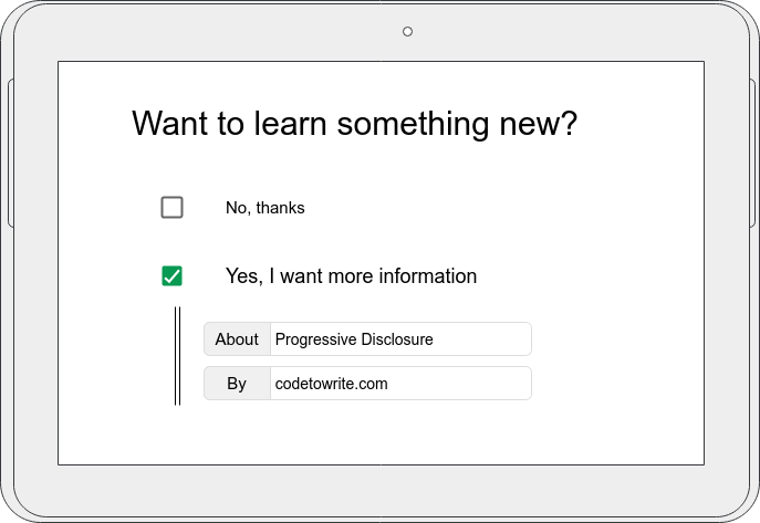

Applications and websites aim to be simple and concise. The user should be able to identify the most important features and information within seconds and proceed towards his goal. However, there are many features worth implementing, sometimes too many. In the worst case, too many features lead to a cluttered interface, distracting the user and making the most important pieces harder to find. Progressive Disclosure can balance simplicity and power by prioritizing frequently used features on the main screen and moving less often used ones to secondary screens. The term screen does not necessarily refer to an actual screen or window here. It could also be a piece of information hidden behind a toggle on the same page, eventually directly next to a related widget or element.
Examples
One of my favorite examples is the internet itself. Chances are that you are reading this article because you found it on a search engine. At first, you enter a term or phrase you want more information about. Afterwards a selection of results is presented to you. Typically, each of these results contains a link to the corresponding website. The internet is organized by links which let you get deeper into it hence you are constantly progressing your way between websites. Just imagine the horror of not having search engines but instead a simple site containing links to all websites ever created. This would technically work just fine, after all you could still find what you are looking for, but in practice it would just be a horrible mess.
To provide a software example, let’s have a look at Shutter. Upon starting the application there are three dominant features in the menu bar. Selection, Desktop and Window. Since the application is used to take screenshots, the context implies that you can take a shot of a whole window, your desktop or a selection.
Now the arrows next to the latter two options indicate that there is more to it. As you can see in the video, it is also possible to screenshot another workspace or select a window. Progressive Disclosure is used correctly here, as adding all these possibilities to the menu bar would overload it. The interface would look cluttered and the three main features lose their prominence.
Benefits and Approach
So what exactly can be gained from implementing Progressive Disclosure? First of all, the interface becomes cleaner. This is important to inexperienced users who might check out your website or application for the first time or generally just use it infrequently. In this context clean is to be understood quite literally. There are less things going on in the most important screens and therefore less opportunities to do something bad that might lead to unexpected results. Secondly. it makes the designers think about a proper information structure. Having optional and advanced features concealed leads to implementing ways of disclosing them, which requires a progression through your interface. Therefore, the term Progressive Disclosure is well chosen and self explanatory.
Hiding configuration options from users immediately results in less users seeing them. While this is anticipated and wanted, these options now must be filled with reasonable default settings. The golden rule here is to follow expectations and be consistent. Whenever a reasonable default value can not be determined it is wrong to assume just anything. Instead the configuration shall not be hidden.
Best Practice
- Indicate “there’s more” as simple as possible. Follow conventions of using arrows, angles or +/- signs.
- Organize information sanely. Group options and controls about the same information together.
- Remember user’s choices. Disclosed information shall be still visible when navigating back or visiting the screen another time. Keep entered data for future sessions.
- Be persistent. Use the same approach to Progressive Disclosure wherever possible and stick to conventions.
Common Mistakes
- Don’t assume tech literacy implies the need or want for all possible options. Even the most frequent users don’t necessarily need all options displayed at once.
- Avoid implementing Progressive Disclosure as one-way street. What has been shown should be hidden again, if not needed any longer.
- Refrain from using Buttons to toggle visibility. Buttons perform operations, hence altering the state of a system and not its presentation.
How to implement Progressive Disclosure
- Identify the most frequently used features. Analytics can help you do so. These features shall stay easily accessible.
- Organize information and configuration options. Put together what belongs together. If you run an online store a possible distinction between: Product details, User information, Shipment and Payment would be reasonable.
- Remove secondary elements from the main screens. Hide what is not often used or does rarely deviate from the default.
- Test your results. Run user tests and collect data. Do the changes meet the goals of improved usability? How much faster do users achieve their goals? Did they miss something? Evaluate your results and reiterate the process if needed.
Further Reading
More Examples: Shutter, Amazon – Product details, Google News – Read more links
Links: Microsoft – Progressive Disclosure Controls.
Sources: [1] Picture and Citation from nngroup.com